Create research plots with Claude Code and Academic Plotting
A worked example of a publication-style research plot: task brief, synthetic dataset, matplotlib script, SVG output and a checklist for axes, units and size.
This walkthrough shows how to turn a table of results into a clean, checked figure with a coding agent. It uses a small synthetic dataset made up for this page, a short matplotlib script and an explicit list of checks. None of the numbers are real research results, and a plotting skill does not run or write up a research project for you. It makes figures from the results you give it.
#What this example covers
Academic Plotting is a hosted SkillGild skill that picks a chart type for results and writes matplotlib or seaborn code, or plans an architecture diagram from a method description. The script and output below were produced by running the plotting code locally. They illustrate the kind of result you should expect to review; they are not a recording of the hosted skill's output. The authenticated run is covered separately.
#The task brief
A good brief gives the agent the data, the claim and the constraints. Without them the agent has to guess, and a plot built on guesses can look right and be wrong.
Plot validation accuracy against training steps for two methods,
Baseline and Example method, from synthetic_accuracy.csv.
Show the mean across 3 seeds with a shaded band for one standard
deviation. Label axes with units. Use direct labels instead of a legend.
Export SVG and PNG. The figure must stay legible when scaled to a
single column. Do not change or add data.
The last sentence matters. Ask the agent to report any data problem it finds, not to repair it.
#Environment and dependencies
- Python 3 with
matplotlibandnumpy. The example ran on matplotlib 3.11.2. - Nothing else: no network access is needed to draw the figure.
With the hosted skill, your own agent does the local work, so these libraries must exist on your machine. See agent skills vs MCP servers for what runs where.
#The synthetic dataset
Download synthetic_accuracy.csv. It has 42 rows: two methods, three seeds and seven training-step checkpoints. Values are validation accuracy in percent. They come from invented saturating curves plus seeded random noise, produced by make_dataset.py. Do not cite them as measurements.
method,seed,step,val_accuracy_pct
Baseline,0,0,10.0
Baseline,0,500,18.57
Baseline,0,1000,24.75
Baseline,0,2000,35.22#The plotting script
The full script is plot_results.py. These are the lines that decide how the figure reads:
matplotlib.rcParams["svg.fonttype"] = "none"   # keep text as text in the SVG

fig, ax = plt.subplots(figsize=(6.5, 3.6), layout="constrained")
for method, by_step in runs.items():
    ...
    ax.fill_between(xs, mean - std, mean + std, color=c, alpha=0.16, lw=0)
    ax.plot(xs, mean, color=c, lw=2.2, marker="o", ms=4.5, mfc="white", mew=1.6)
    ax.annotate(f"{method}\n{mean[-1]:.1f}%", (xs[-1], mean[-1]), ...)

ax.set_xlabel("Training steps (thousands)")
ax.set_ylabel("Validation accuracy (%)")
ax.set_ylim(0, 90)
The choices have reasons. The band shows spread across seeds, so a reader can see whether the gap between methods is larger than the noise. Direct labels at the line ends replace a legend that would sit on top of the data. Keeping SVG text as text means the labels stay editable and searchable. The y-axis starts at zero so the gap is not exaggerated.
#The output
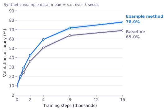
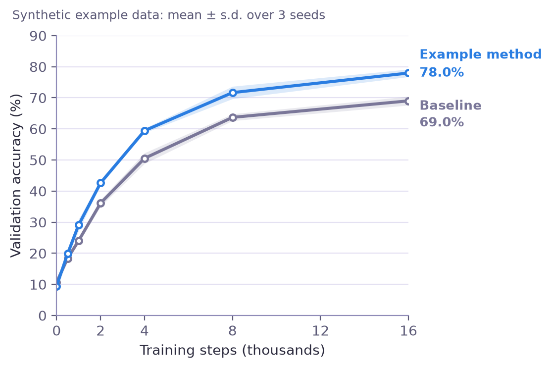
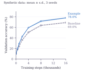
Download accuracy_curve.svg or accuracy_curve.png. The curves are invented, so the figure shows the format, not a finding.
#Checks before you use a figure
Run the checks yourself on every figure an agent produces. For this one we checked:
| Check | Result for this figure |
|---|---|
| Axis labels and units | x: "Training steps (thousands)"; y: "Validation accuracy (%)" |
| Axis ranges | x from 0 to 16; y from 0 to 90, baseline at zero |
| Values match the data | End labels 78.0% and 69.0% equal the mean of the three seeds at step 16000 in the CSV |
| Uncertainty shown | Shaded band is one standard deviation across 3 seeds, stated in the figure heading |
| Synthetic data flagged | The figure heading says "Synthetic example data" |
| Export size | SVG about 5.6 by 3.7 inches; PNG 1115 by 743 pixels at 200 dpi |
| Text stays text | The SVG keeps labels as text elements, not outlines |
For your own work add the checks that depend on the venue: the column width, font size at final size, colour-blind safe colours and whether the caption states the number of runs. A checklist like this is a review step, not proof of a correct result.
#Run it with the skill
The steps below are the supported Claude Code route. The figure above is an illustrative local output. A separate authenticated production run by Codex is documented in the recorded session below; it does not establish that these Claude Code steps were recorded end to end.
Follow how to install Claude Code skills to install the CLI, sign in and register the MCP server.
Install the wrapper:
sh skillgild install academic-plotting --agent claude-codeIn Claude Code, give the agent your real results file and a brief like the one above, and ask it to use the SkillGild Academic Plotting skill.
Review the script and the figure against the checks, then regenerate with your own corrections.
Read the Academic Plotting listing for its inputs and current allowance. Never ask the agent to invent data to complete a brief.
#Limits
A plotting skill can choose a chart type and write the code. It cannot tell whether your experiment was sound, whether a difference is statistically meaningful or whether a journal accepts the style. Those stay your decisions. For more workflows, see the free skills selection guide and the Claude skills overview.
Recorded production Academic Plotting session
On 4 October 2026, Codex started an authenticated session for Academic Plotting version 1.1.0 against SkillGild's production API, followed the skill guide and created the chart locally. This is a Codex run through the API, rather than a recording of Claude Code. The dataset is synthetic.
The hosted palette validator found that the original series colors passed 3:1 contrast for graphics but failed 4.5:1 for small colored labels. We changed the label and line colors to darker shades. The validator then returned ratios of 5.14:1 and 5.60:1 against white. This checks contrast; it doesn't establish scientific validity or a complete accessibility audit.
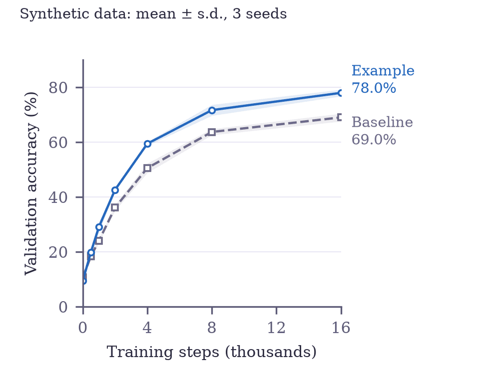
Download the SVG, PDF or 300 dpi PNG. Reproduce the figure with the plotting script, CSV and dependency versions. The public run record includes the actual validator results and excludes credentials and the session guide.
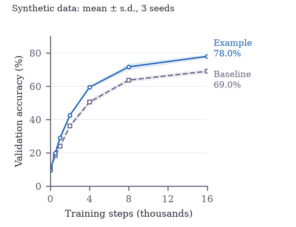
Keep the downloads together and run python gen_fig_accuracy.py in an environment with the recorded dependencies. Figure size is 3.25 by 2.5 inches; PNG size is 975 by 750 pixels. The final labels round to 69.0% and 78.0%, matching the same input CSV used above.