UI UX Pro Max skill: a design database for Claude Code, tested
What is inside UI UX Pro Max (192 palettes, 88 styles, 119 UX rules and a search script), how to install it, and the design system and page it produced on a real brief.
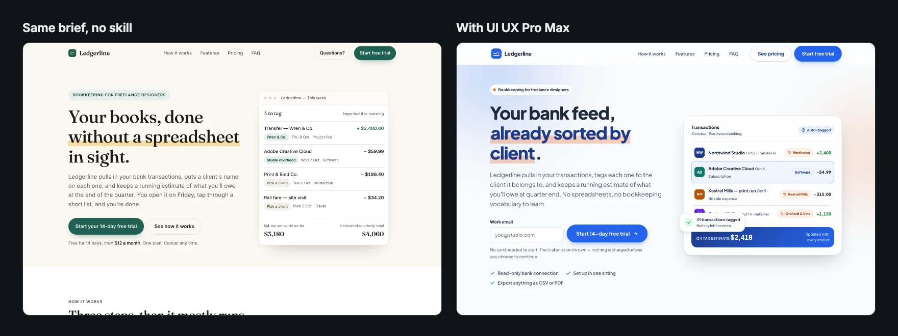
UI UX Pro Max is the design skill that brings data instead of opinions. Where Anthropic's frontend-design skill and Taste Skill are written rules, UI UX Pro Max ships a searchable library of styles, palettes, font pairings and UX guidelines, plus a Python script your agent queries before it designs. Its repository by nextlevelbuilder had about 134,000 stars on 9 October 2026, which makes it one of the most-starred design skills for coding agents.
We ran it on a real brief and compared the page with one built from the same brief and no skill. Here is what it contains, how to install it, what its search returned, and what came out.
Try it on a real task: UI UX Pro Max is free for 25 runs a month.
#What is inside
The skill folder holds a SKILL.md of about 200 lines, a data/ folder of CSV files and a scripts/search.py that searches them. Counted on 9 October 2026, the CSVs held:
| Data | Rows |
|---|---|
| Colour palettes, each tied to a product type | 192 |
| Industry reasoning rules | 192 |
| UX guidelines with rationale | 119 |
| Curated icons | 105 |
| UI styles (the skill says 79 are searchable, 50 active) | 88 |
| Font pairings | 74 |
| Landing page patterns | 34 |
| Chart types | 25 |
| GSAP motion presets | 17 |
The search script uses only Python's standard library, and the README states it makes no network calls.
The SKILL.md tells the agent how to use all this. For a new page, run search.py with --design-system to get a whole direction at once: a page pattern, a style, a palette, a type pairing and effects. For a narrower question, search one domain (--domain ux, typography, color, landing, icons) or a technology stack (--stack). It ranks ten rule categories by priority, from accessibility and touch targets down to charts, and it is explicit that search results are recommendations that never override the user.
#Install it
As a Claude Code plugin:
/plugin marketplace add nextlevelbuilder/ui-ux-pro-max-skill
/plugin install ui-ux-pro-max@ui-ux-pro-max-skill
With the author's CLI, which also targets Cursor, Codex, Copilot and others:
npm install -g ui-ux-pro-max-cli
uipro init --ai claude
Or from SkillGild:
skillgild install ui-ux-pro-max --agent claude-codeYou need Python 3 for the search script.
#The test
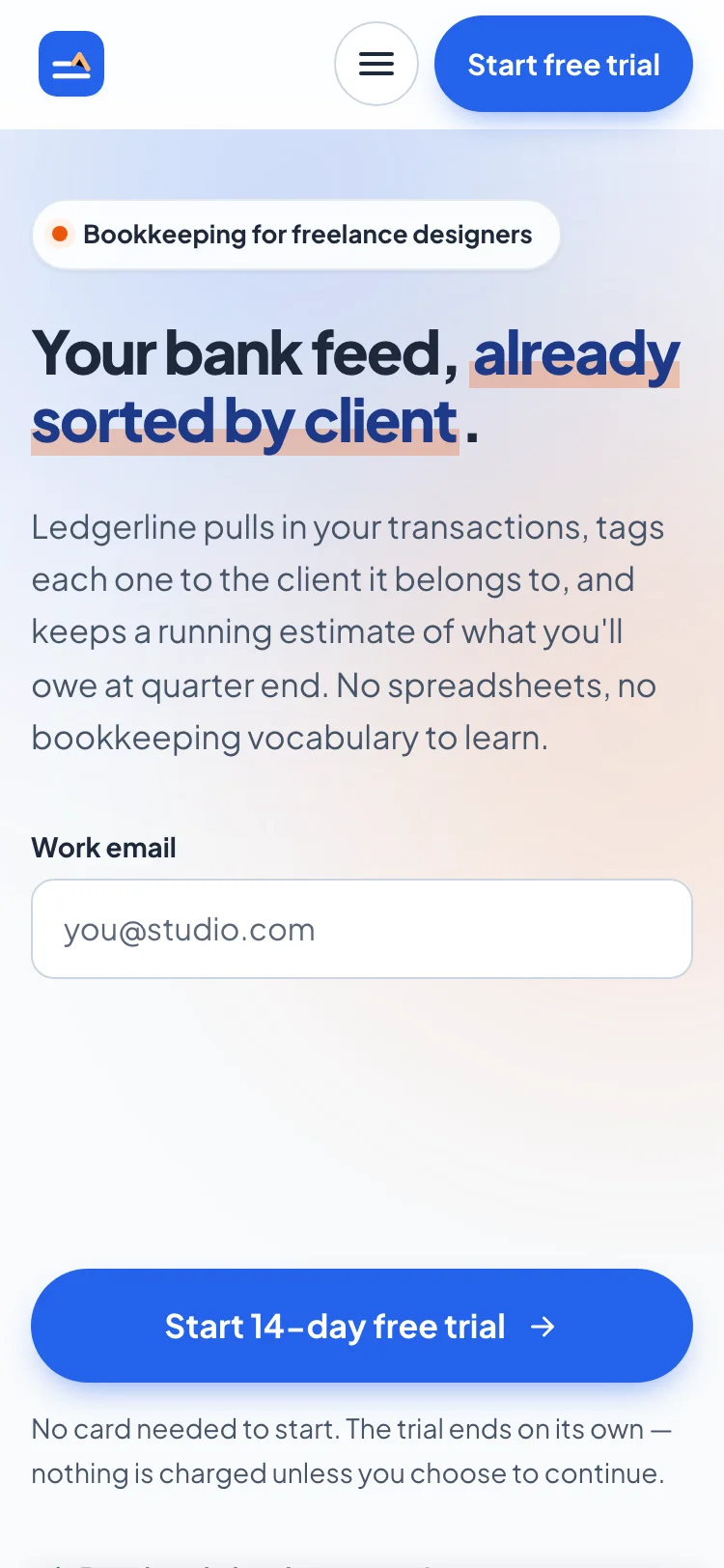
The brief: a landing page for Ledgerline, a fictional bookkeeping app for freelance designers, written as one self-contained HTML file with Google Fonts as the only external resource. It listed the sections and forbade invented testimonials, customer counts, logos and awards. One run followed UI UX Pro Max; one had no skill. Both used Claude Code 2.1.278 with Claude Opus 5 on 9 October 2026, with the Skill tool switched off so nothing else installed could load. One run each, so this is an example rather than a benchmark.
#What the search returned
The agent's first move was the design-system search. We reran its exact command afterwards; the search is deterministic, so this is the output it worked from:
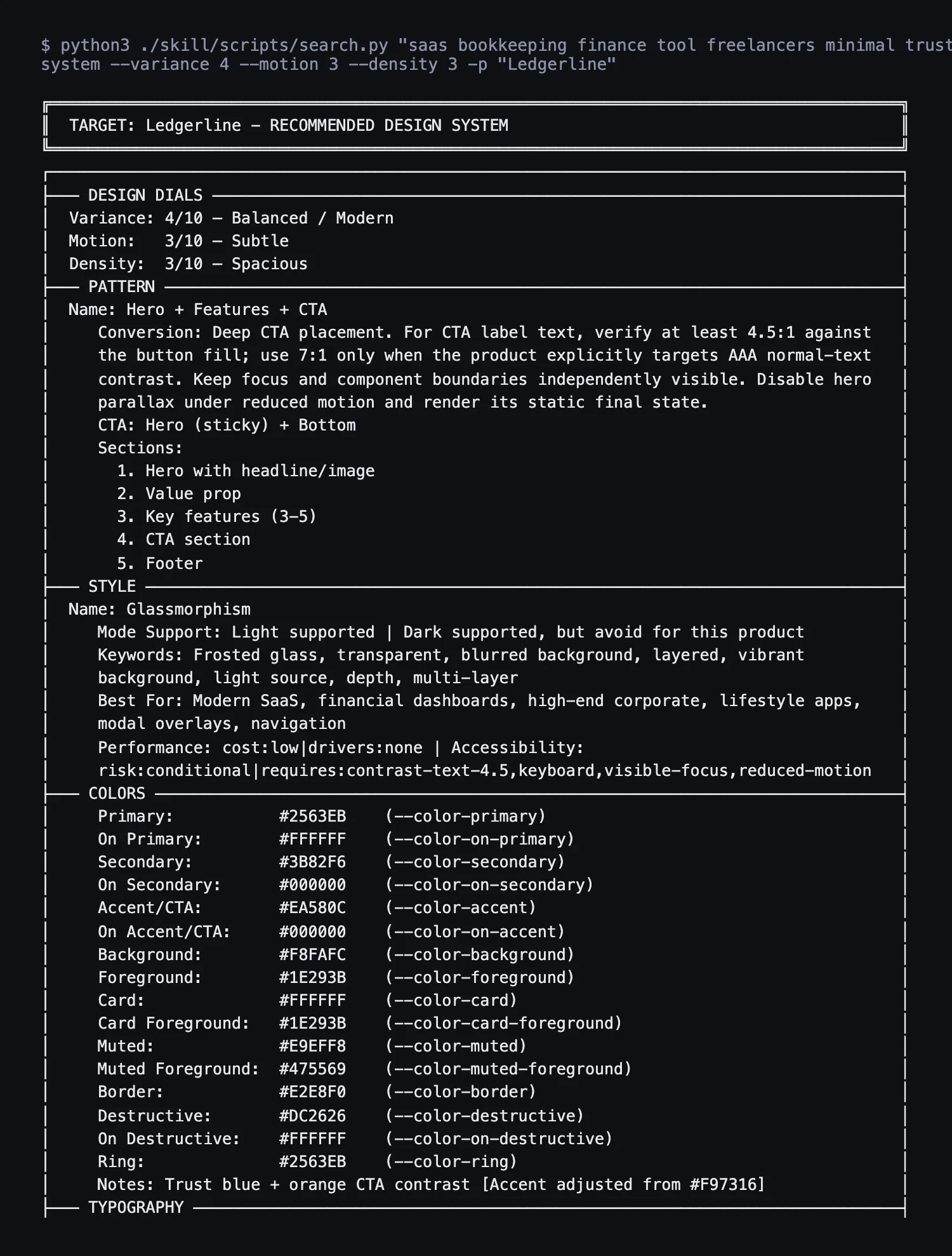
It then made four narrower searches: accordion keyboard behaviour, single-plan pricing pages, icons for transactions and receipts, and preventing horizontal scroll. The recommendation is sensible for a finance product, and also very familiar: a "trust blue" #2563EB, a light slate ground, one sans-serif and frosted glass. It is close to the "SaaS card kit" that Anthropic's own skill lists as a generated-design tell. A database of what works for a product type tends to return what most products of that type already look like.
#The page
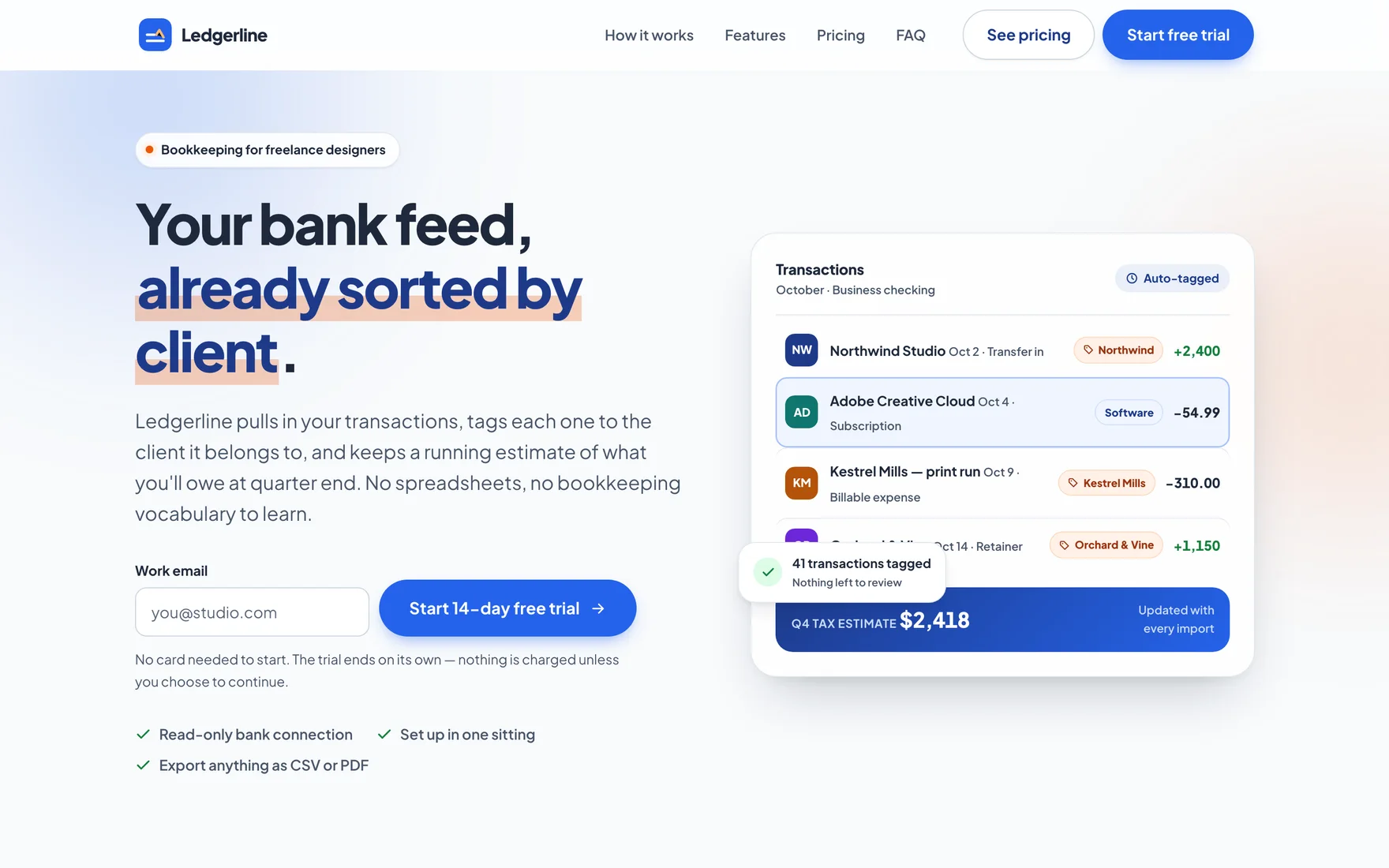
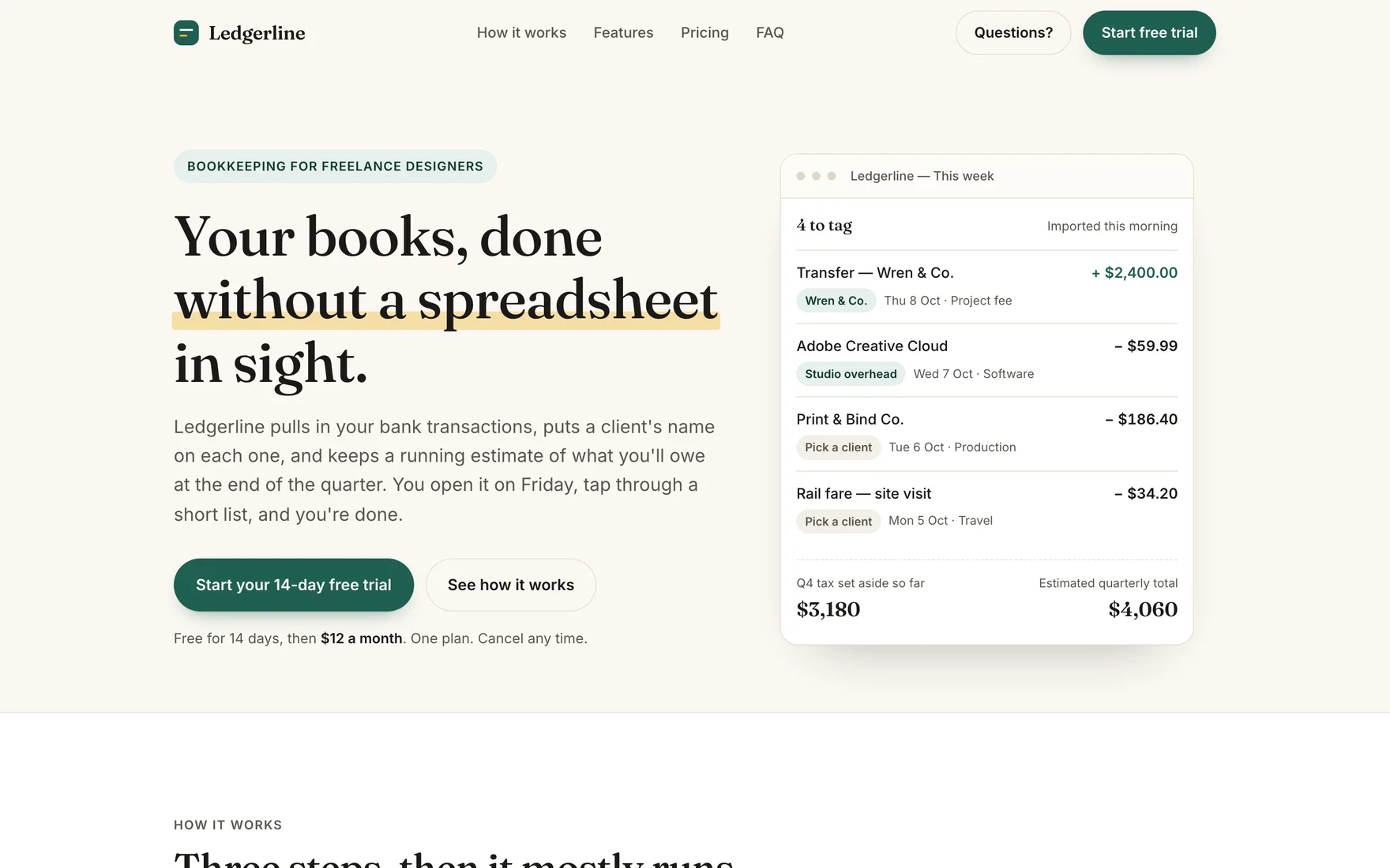
The agent applied the glass style with restraint (frosted header, hero card and pricing card, flat elsewhere) and kept the dark mode off, as the search advised for this product. It noticed that the recommended orange accent reached only about 3.3:1 contrast on the page background and darkened it to #9A3412 wherever orange carried text. It added a skip link, 44 px touch targets, an FAQ built on real buttons, and a sticky trial bar on mobile that appears once the hero form scrolls away.
It was also the longest page in the test, at about 850 visible words, and it kept most of the template chrome the other skills avoided:
| Tell | No skill | UI UX Pro Max |
|---|---|---|
| All-caps labels | 9 | 9 |
A · B middle-dot strings |
4 | 5 |
| Spaced em dashes | 10 | 10 |
| One phrase accented in the headline | Yes | Yes |
| Horizontal scroll at 375 px | 16 px overflow | None |
That is not a failure of the skill so much as a difference in what it is for. UI UX Pro Max is checking accessibility, touch and layout rules, and on those it did well: no overflow at 375 px, contrast fixed, keyboard-friendly components. It does not try to make a page look less like other pages.
#What went wrong
An overlapping card. In the hero, the floating "41 transactions tagged" confirmation sits on top of the fourth transaction row and hides its client name at 1440 px. Our brief told every run not to open a browser, so none of them could look at its own page; one screenshot of the hero would have caught this. If your setup allows it, ask the agent to check the page visually.
Invented product facts. Like every run in the test except Impeccable's, this one added claims the brief never made: "No card needed to start", a "read-only banking provider" covering "most retail and business banks in the US, UK and EU", CSV and PDF exports, read-only links for your accountant, and data kept for 30 days after the trial. UI UX Pro Max made the most of these, partly because it wrote the most copy.
The run took 17 turns and 8.3 minutes, with an API-equivalent cost of $2.42 reported by Claude Code, against 2 turns, 3.3 minutes and $0.98 for the baseline.
#When to use it
Pick UI UX Pro Max when you want a defensible starting system fast, or a second opinion on a specific UX question: the domain searches are quick and specific ("focus not obscured", "badge chip label wraps"). Expect a conventional result unless you push against it. Two habits help:
Use UI UX Pro Max. Run the design-system search, then show me the
recommendation before building. Product facts, and nothing else: <facts>.
Avoid glassmorphism and blue-on-slate; we want <direction>.
After building, screenshot the hero at 1440 px and 375 px and fix overlaps.
For a page that must stand apart, start with frontend-design or Taste Skill and use UI UX Pro Max's UX searches as the checklist. The top Claude frontend and design skills compares all of them.
Frequently asked questions
What is UI UX Pro Max?
A design skill by nextlevelbuilder that ships CSV data (192 palettes, 88 UI styles, 74 font pairings, 119 UX guidelines and more) and a Python search script. The agent searches it for a full design system or a specific UX rule before writing code.
How do I install UI UX Pro Max in Claude Code?
Add the marketplace with /plugin marketplace add nextlevelbuilder/ui-ux-pro-max-skill, then /plugin install ui-ux-pro-max@ui-ux-pro-max-skill. You can also use npm install -g ui-ux-pro-max-cli and uipro init --ai claude, or skillgild install ui-ux-pro-max. The search script needs Python 3.
Is UI UX Pro Max better than the frontend-design skill?
They do different jobs. UI UX Pro Max recommends a conventional, defensible system and is strong on accessibility and layout rules; in our test its page had no mobile overflow but kept generic labels and a glass and trust-blue look. The frontend-design skill pushes for a distinctive direction instead.
This article is also on DEV. Read and discuss it on dev.to